In 2008, while in school, I was approached by the Art Chair at William Carey University to see if a new logo could be established for the school. I would have my info sent back and forth between Gulfport and the main campus in Hattiesburg, Mississippi.
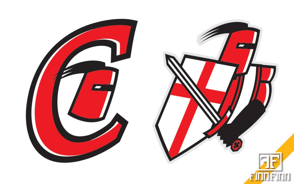
As I first started coming up with a concept, I researched crusader knights at the time and tried to establish a pattern for the helmet that was closer to what they had. My first result was not good at all; it was a bulky character with a small sword that didn’t match. The second result was better, but it still had its flaws, partially my fault because I used the same shield and sword from the first concept.
The feedback I got was to make it simpler, and I attempted to go that route and came up with a design I actually liked that would’ve worked (I skewed this version out for viewing purposes). Unfortunately, got more feedback: if I remember right, it was “remove the spikes from the crusader helmet” and “keep the C” at the same time (the next image in order shows the “old” William Carey Crusader logo with the spikes).
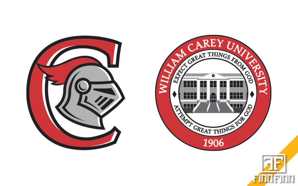
What I next established was a concept with just a little more complexity. It was just enough I thought it’d make a case to the new university logo. I even created a new university seal to use along with it where it was a full frontal view, brick by brick built. It got me a local Student Silver Addy award for creating a new guide, but I never heard back from the President of the school.
A couple years later, in roughly 2011, I found out they went through 99designs.com to get a new Crusader design done, which disappointed me after my efforts; they still use that logo to this day for their athletics programs. This was not the last time I’d be disappointed though.
William Carey – My 1st Attempt to Establish a New Logo


Leave a comment